


Gerard Sans | Axiom 🇬🇧 PRO
Founder of Axiom Masterclass, professional trainings // Forging skills for the new era of AI. GDE in AI, Cloud & Angular. Building London's tech & art nexus @nextai_london. Speaker | MC | Trainer.
Gerard Sans | @gerardsans
Spoken at 106 events in 27 countries
900
1.6K
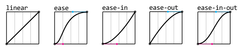
DURATION
opacity: 0;
opacity: 1;
PROPERTY
transition: opacity 1s ease-in 1s;
DURATION
TIMING
DELAY
<div class="container">
  <div class="circle base elastic"></div>
</div>

.circle {
  border-radius: 50%;
  position: absolute; opacity:0;
  will-change: opacity, transform;
}
.base {
  transition: opacity 1s ease,
   transform 1s ease;
}
.elastic {
  transition-timing-function:
   cubic-bezier(.8,-0.6,0.2,1.5);
}
.container:hover .circle {
  transform: translateX(80px);
  opacity:1;
}all background* border* bottom box-shadow clip clip-path color filter font* height left margin* mask* offset* opacity outline* padding* perspective* right text-decoration text-shadow top transform vertical-align visibility width z-index
DURATION
0%
100%
KEYFRAMES
NAME
animation: fade 1s 1s infinite linear;
DURATION
DELAY
ITERATIONS
TIMING
<div class="circle base elastic"></div>

.base {
  animation: fade 2s infinite;
}

@keyframes fade {
  0% {
    transform: translateX(0px);
    opacity: 0;
  }
  40%, 60% {
    transform: translateX(80px);
    opacity: 1;
  }
  100% {
    transform: translateX(0px);
    opacity: 0;
  }
}60 FPS
Time
16.66ms
16.66ms
16.66ms
1000/60ms
paint
frame
paint
frame
paint
frame
😃
paint
frame
paint
frame
60 FPS
Time
16.66ms
16.66ms
16.66ms
😱
Move
transform: translateX(10px);
Resize
transform: scale(0.5);
Rotate
transform: rotate(1turn);
Fade
opacity: 0;
<div class="circle base elastic"></div>

.base {
  animation: move 2s infinite;
}
.elastic {
  animation-timing-function:
    cubic-bezier(.8,-0.6,0.2,1.5);
}

@keyframes move {
  0% {
    transform: translateX(-250px);
  }
  40%, 60% {
    transform: translateX(50px);
  }
  100% {
    transform: translateX(250px);
  }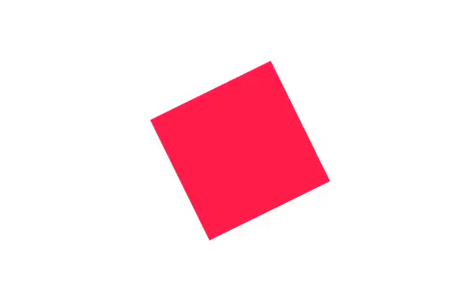
}<div class="square base linear"></div>
.base {
animation: spin 2s infinite;
}
.linear {
animation-timing-function: linear;
}
@keyframes spin {
to {
transform: rotate(1turn);
}
}<div class="circle base"></div>
.base {
animation: size 2s infinite;
}
@keyframes size {
0%, 40%, 100% {
transform: scale(1);
}
25%, 60% {
transform: scale(1.1);
}
}.fade-in
.fade-out
opacity: 1
opacity: 0
transition: opacity 1s;
.fade
show/hide
<template>
  <div class="box" @click="show=!show">
    <div class="circle fade"
      :class="show?'fade-in':'fade-out'"></div>
  </div>
</template>
<script>
export default {
  data() {
    return {
      show: false
    };
} }
</script>
src/app.component.ts
src/App.vue
<style>
.fade {
  transition:
   opacity 400ms cubic-bezier(.8,-0.6,0.2,1.5),
   transform 400ms cubic-bezier(.8,-0.6,0.2,1.5);
}
.fade-in {
  opacity: 1;
  transform: translateX(80px);
}
.fade-out {
  opacity: 0;
}
</style>
src/app.component.ts
src/App.vue
CSS
JS
v-leave
v-leave-active
v-leave-to
v-enter
v-enter-active
v-enter-to
opacity:0
opacity:1
setup
setup
DOM added
DOM removed
raf
raf
opacity:0
opacity:1
<template>
  <div class="box" @click="show=!show">
    <transition name="fade">
      <div class="circle" v-if="show"></div>
    </transition>
  </div>
</template>
<script>
export default {
  data() {
    return {
      show: false
    };
</script>
src/app.component.ts
src/App.vue
<style>
.circle {
  transform: translateX(80px);
}
.fade-enter, .fade-leave-to {
  opacity: 0;
  transform: translateX(-80px);
}
.fade-enter-active, .fade-leave-active {
 transition: opacity 400ms cubic-bezier(.8,-0.6,0.2,1.5),
   transform 400ms cubic-bezier(.8,-0.6,0.2,1.5);
}
.fade-enter-to, .fade-leave {
  opacity: 1;
}
</style>
src/app.component.ts
src/App.vue
CSS
JS
<template>
  <div class="box" @click="show=!show">
    <transition name="fade" :css="false"
      @enter="fadeIn" @leave="fadeOut">
      <div ref="circle" class="circle" v-if="show"></div>
    </transition>
  </div>
</template>
<script>
export default {
  methods: {
    fadeIn: function(el, done){ ... },
} };
</script>
src/app.component.ts
src/App.vue
fadeIn: function(el, done) {
  const animation = this.toggle(el, 0, 1);
  animation.onfinish = done;
},
toggle: function(el, from, to){
  const start = from?80:0;
  const end = from?0:80;
  return el.animate([
    { opacity: from, transform: `translateX(${start}px)` },
    { opacity: to, transform: `translateX(${end}px)` }
   ], {
     duration: 400, fill: "both",
     easing: 'cubic-bezier(.8,-0.6,0.2,1.5)'
   });
}
src/app.component.ts
src/App.vue
source: blog
<div class="buttons-container">
  <button @click="add()">+</button>
  <button @click="remove(0)" :disabled="list.length===0">-</button>
</div>
<div class="list-container">
  <transition-group name="list">
    <div class="box"
      v-for="(item, index) in list"
      :key="item">
    </div>
  </transition-group>
</div>
src/app.component.ts
src/App.vue
.list-enter-to
scale(1)
opacity 1
scale(0.5)
opacity 0
.list-enter
.list-enter-active
add
<style>
.list-enter {
  transform: scale(0.5);
  opacity: 0;
}
.list-enter-to {
  transform: scale(1);
  opacity: 1;
}
.list-enter-active {
  transition: transform 1s cubic-bezier(0.8,-0.6,0.2,1.5),
    opacity 1s cubic-bezier(0.8,-0.6,0.2,1.5);
}
</style>
src/app.component.ts
src/App.vue
STATE
STATE
scale(0.5)
opacity 0
scale(1)
opacity 1
.list-leave-active
remove
.list-leave-to
.list-leave
<style>
.box.list-leave {
  transform: scale(1); opacity: 1;
  height: 50px; margin: 5px;
}
.box.list-leave-to {
  transform: scale(0.5); opacity: 0;
  height: 0px; margin: 0px;
}
.list-leave-active {
  transition: transform 1s cubic-bezier(0.8,-0.6,0.2,1.5),
    opacity 1s cubic-bezier(0.8,-0.6,0.2,1.5),
    height 1s cubic-bezier(0.8,-0.6,0.2,1.5),
    margin 1s cubic-bezier(0.8,-0.6,0.2,1.5);
}
</style>
src/app.component.ts
src/App.vue
time
<div class="list-container">
  <transition-group name="list"
    appear @appear="this.stagger = true">
    <div class="box"
      v-for="(item, index) in list" :key="item"
      :style="this.stagger?null:{transitionDelay: index*300+'ms'}">
    </div>
  </transition-group>
</div>
src/app.component.ts
src/App.vue
By Gerard Sans | Axiom 🇬🇧
In this talk we are going to cover some of the 12 principles behind UX Motion giving practical examples. We will focus on these principles while covering some implementation details.


