A Bootstrap Journey
Crafting Navigations With Bootstrap
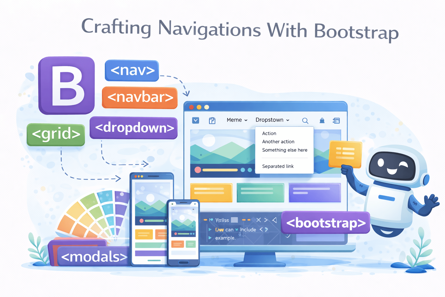

Learning Outcome
Style the LOGO/BRAND name in the navbar
Style NAVIGATION elements like lists of links or tabs
Style the button that TOGGLE the collapsible navbar menu
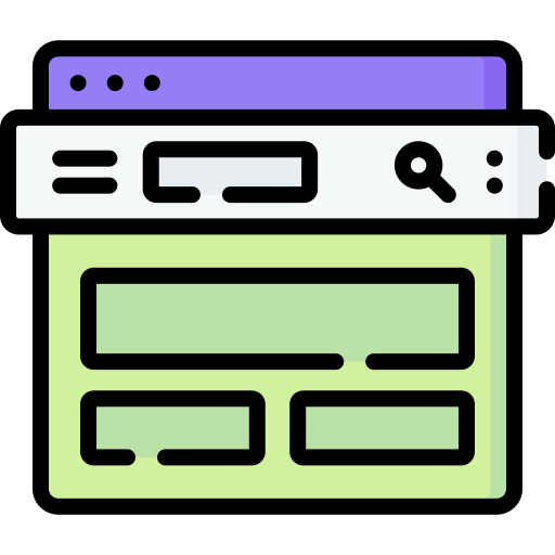
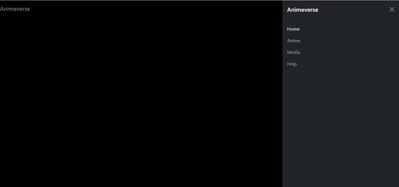
Navbar
Let's Explore How To Style Our Navigation Bar Using Bootstrap

2
Nav
Brand
1
Toggler
3
Before We Dive Into The Navbar, Let's Preview Its Appearance On The Bootstrap Website
Bootstrap Website
Bootstrap Website
Docs
Docs
Components
Components
Navbar
Navbar

Let's Uncover What A Navbar Is
Copy the code from the website, paste it into your editor, and customize it as needed

Let's Create A Navbar For Our Animeverse Website
We have copied the code below to customize it as per our requirements
Let's observe how this code performs...


<body class="bg-black text-white">
<div class="container-fluid">
<nav class="navbar navbar-dark bg-black fixed-top">
<!-- code to style navbar -->
</nav>
</div>
</body>
<body class="bg-black text-white">
<div class="container-fluid">
<nav class="navbar navbar-dark bg-black fixed-top">
<!-- code to style navbar -->
</nav>
</div>
</body>

It sets the background color of an element to black
This class sets the text color of an element to white


<body class="bg-black text-white">
<div class="container-fluid">
<nav class="navbar navbar-dark bg-black fixed-top">
<!-- code to style navbar -->
</nav>
</div>
</body>


This class in Bootstrap creates a full-width, responsive container
It is used to create a responsive navigation bar in Bootstrap.
It styles the navbar with dark colors for better contrast
It fixes an element at the top of the viewport during scrolling in Bootstrap.
How Would You Showcase Your Company Logo And Name In A Bootstrap Navigation Bar?

Elevating Your Brand With Logo & Name In Bootstrap Navbar Using Nav-brand
Let's add brand name as a link
Let's add brand name as a heading

<div class="container-fluid">
<nav class="navbar navbar-dark bg-black fixed-top">
<h1 class="navbar-brand" >Animeverse</h1>
<!-- code to style navbar -->
</nav>
</div>`navbar-brand` is used in Bootstrap to style the logo or brand name within a navbar.
<div class="container-fluid">
<nav class="navbar navbar-dark bg-black fixed-top">
<a class="navbar-brand" href="#">Animeverse</a>
<!-- code to style navbar -->
</nav>
</div>
<div class="container-fluid">
<nav class="navbar navbar-dark bg-black fixed-top">
<a class="navbar-brand" href="#">
<img src="./image" alt="image">Animeverse
</a>
<!-- code to style navbar -->
</nav>
</div>You can also combine a logo and name together like this
Note:


What Class Is Used In Bootstrap To Style An Unordered List As Part Of A Navigation Bar?
Turn Your List Into A Nav Bar With Bootstrap's `navbar-nav` Class
<div class="offcanvas-body">
<ul class="navbar-nav justify-content-end flex-grow-1 pe-3">
<!-- code to define menu list -->
</ul>
</div>`offcanvas-body` styles the main content area in an off-canvas sidebar or modal in Bootstrap
`navbar-nav` is a class in Bootstrap used to style and structure navigation links within a navbar.
<div class="offcanvas-body">
<ul class="navbar-nav justify-content-end flex-grow-1 pe-3">
<!-- code to define menu list -->
</ul>
</div>`flex-grow-1` makes an element grow to fill available space within a flex container
<div class="offcanvas-body">
<ul class="navbar-nav justify-content-end flex-grow-1 pe-3">
<!-- code to define menu list -->
</ul>
</div>`pe-3` is a Bootstrap utility class that adds padding to the right side of an element
Turn Your List Into A Nav Bar With Bootstrap's `navbar-nav` Class
<div class="offcanvas-body">
<ul class="navbar-nav justify-content-end flex-grow-1 pe-3">
<li class="nav-item ">
<a class="nav-link active" aria-current="page" href="#">Home</a>
</li>
<li class="nav-item">
<a class="nav-link" href="#">Anime</a>
</li>
<li class="nav-item">
<a class="nav-link" href="#">Media</a>
</li>
<li class="nav-item">
<a class="nav-link" href="AnimeV4.html">Help</a>
</li>
</ul>
</div>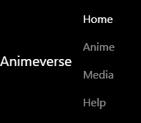
The `nav-item` class styles individual navigation items within a navbar
`nav-link` styles links within navigation items in a Bootstrap navbar.

How Can We Create A Responsive Button To Toggle The Navigation Menu Or Sidebar?
<nav class="navbar navbar-expand-lg bg-body-light">
<div class="container-fluid">
<!-- code to add logo and brandname -->
<button class="navbar-toggler" type="button" data-bs-toggle="collapse" data-bs-target="#mynav">
<span class="navbar-toggler-icon"></span>
</button>
<div class="collapse navbar-collapse" id="mynav">
<!--code to list down menu -->
</div>
</div>
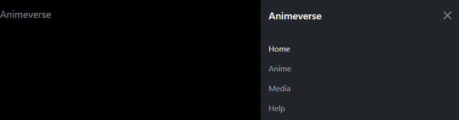
</nav>Mastering Mobile Navigation With Bootstrap Building A Responsive Sidebar
`offcanvas` in Bootstrap creates a sidebar or modal navigation menu that slides in from the side when activated
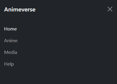
<div class="offcanvas offcanvas-end text-bg-dark" tabindex="-1" id="offcanvasDarkNavbar">
<div class="offcanvas-header">
<!--brand name  -->
<h5 class="offcanvas-title" id="offcanvasDarkNavbarLabel">
Animeverse
</h5>
<button type="button" class="btn-close btn-close-white" data-bs-dismiss="offcanvas"
aria-label="Close"></button>
</div>
It creates a sliding sidebar or modal navigation menu when activated
`offcanvas-end` positions a sidebar or modal to slide in from the right when activated in Bootstrap.
It is used to uniquely identify elements for targeted manipulation
<div class="offcanvas offcanvas-end text-bg-dark" tabindex="-1" id="offcanvasDarkNavbar">
<div class="offcanvas-header">
<!--brand name  -->
<h5 class="offcanvas-title" id="offcanvasDarkNavbarLabel">
Animeverse
</h5>
<button type="button" class="btn-close btn-close-white" data-bs-dismiss="offcanvas"
aria-label="Close"></button>
</div>
It creates a sliding sidebar or modal navigation menu when activated
<div class="offcanvas offcanvas-end text-bg-dark" tabindex="-1" id="offcanvasDarkNavbar">
<div class="offcanvas-header">
<!--brand name  -->
<h5 class="offcanvas-title" id="offcanvasDarkNavbarLabel">
Animeverse
</h5>
<button type="button" class="btn-close btn-close-white" data-bs-dismiss="offcanvas"
aria-label="Close"></button>
</div>
Mastering Mobile Navigation With Bootstrap Building A Responsive Menu Toggle
<div class="container-fluid">
<nav class="navbar navbar-dark bg-black fixed-top">
<a class="navbar-brand" href="#">Animeverse</a>
<button class="navbar-toggler" type="button" data-bs-toggle="offcanvas"
data-bs-target="#offcanvasDarkNavbar" aria-controls="offcanvasDarkNavbar"
aria-label="Toggle navigation">
<span class="navbar-toggler-icon"></span>
</button>
<!--   code to style navbar -->
</nav>
</div>`navbar-toggler` creates a button to toggle the menu on small screens.
It triggers the off-canvas sidebar when clicked
<div class="container-fluid">
<nav class="navbar navbar-dark bg-black fixed-top">
<a class="navbar-brand" href="#">Animeverse</a>
<button class="navbar-toggler" type="button" data-bs-toggle="offcanvas"
data-bs-target="#offcanvasDarkNavbar"
aria-controls="offcanvasDarkNavbar"
aria-label="Toggle navigation">
<span class="navbar-toggler-icon"></span>
</button>
<!--   code to style navbar -->
</nav>
</div>`navbar-toggler-icon` adds a default icon to the navbar toggle button.
Let's See Our Code In Action To Understand How It Works And Visualize The Results
Making images responsive with max-width
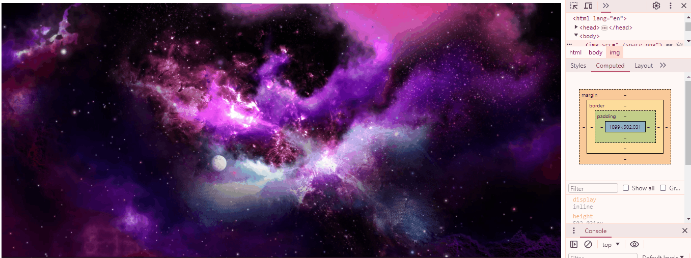
img{
width: 100%;
max-width: 100%;
}
max-width limits how wide an element can be, preventing it from exceeding a specified width
CSS
Now, images can automatically adjust to fit the screen
How Does A Particular HTML Tag Help Web Pages Adapt To Different Devices?

Unleashing The Power To Make Your Website Shine On Any Device
<meta name="viewport" content="width=device-width, initial-scale=1.0">We use the meta viewport tag to control webpage scaling on different devices
We name it "viewport" to specify that the tag controls the visible area of the webpage on different devices.
We specify content in the meta viewport tag to define how the webpage should scale and display on various devices.
ensure that the webpage's width adapts to the device's screen width
establish the initial zoom level of the webpage
We set "initial-scale=1.0" to maintain the webpage's original size upon first loading
< name="viewport" >< content= >< "width=device-width, >< initial-scale=1.0">How Does A Particular HTML Tag Help Web Pages Adapt To Different Devices?
<meta name="viewport" content="width=device-width, initial-scale=1.0">
How Do CSS Units Contribute To Responsive Web Design?


Mastering Absolute & Relative Measures With CSS Units
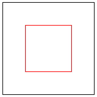
div{
width:50%;
height:400px;
border:2px solid black;
}
relative to their parent's size or the viewport's size
%
100%
How Do CSS Units Contribute To Responsive Web Design?
50%
- Represents the font size of the current element
em
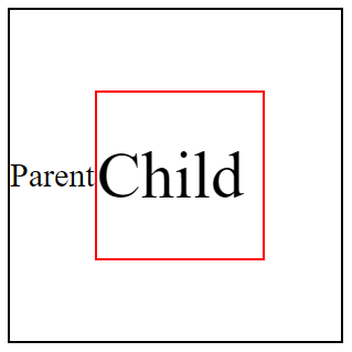
Child Element
Parent Element
font-size : 30px;
font-size : 2em;
- Setting the font size to 2em makes it twice the parent's font size
1vh = 1% Height of viewport
768px
vh
It stands for viewport height and represents a percentage of the browser window's height
1366 pixels wide X 768 pixels high

768px
height:10vh;
1vh = 1% Height of viewport
1vw = 1% Width of viewport
1366px
10vh = 10%
1366 pixels wide X 768 pixels high
width:10vw;
vw
It stands for viewport width and represents a percentage of the browser window's width
1vw = 1% Width of viewport
1/96th of 1in
16px
37.8px
1/10th of 1cm
96px
1/6th of 1in
1366px
10vw = 10%
Mastering Absolute & Relative Measures With CSS Units
1 px (pixel)
1 rem (root em)
1 cm (centimeter)
1 mm (millimeter)
1 in (inches)
1 pc (picas)
1/96th of 1in
16px
37.8px
1/10th of 1cm
96px
1/6th of 1in

Each image on the computer is built from tiny pixels(px)

1px

The smallest unit of measurement in CSS in pixel

1mm
3.7px
1px
16px
4.6mm
1rem(root em)
1cm
37.8px
10mm
1inch
96px
2.54cm
How to Embed A Map?