Visualizing Data with Seaborn - Mumbai West House Pricing

Customizing Seaborn Charts


Learning Outcome
6
Combine multiple plots to reveal both summary statistics and raw data
5
Enhance box plots to better interpret spread and outliers
4
Customize histograms for deeper distribution analysis
3
Create and enhance horizontal bar charts
2
Customize pie charts using Matplotlib alongside Seaborn
1
Explain why customization is necessary beyond default Seaborn plots
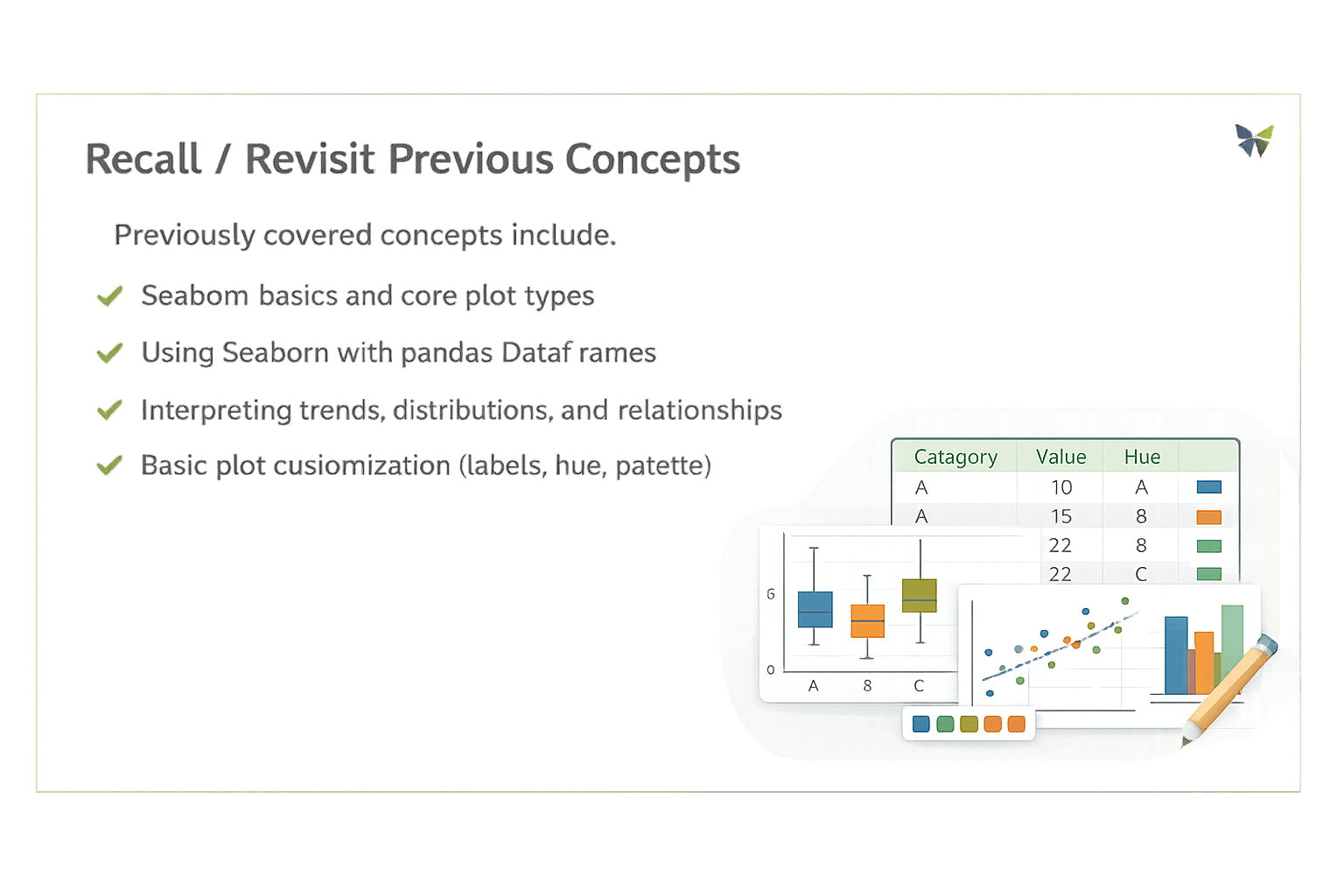
Previously covered concepts include:
Seaborn basics and core plot types
Using Seaborn with pandas DataFrames
Interpreting trends, distributions, and relationships
Basic plot customization (labels, hue, palette)
This topic extends those ideas by focusing on advanced visual refinement and combined visual techniques

Hook/Story/Analogy(Slide 4)
Transition from Analogy to Technical Concept(Slide 5)
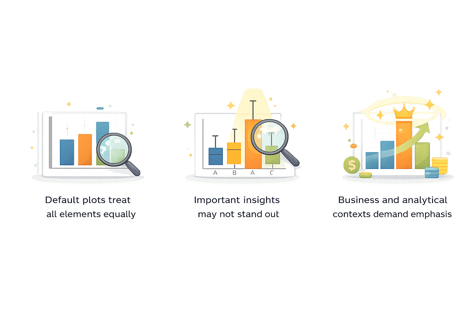
Why Customization is Needed in Seaborn?
Definition
Customization refers to modifying visual properties such as colors, orientation, annotations, and overlays to improve interpretability and focus
Why this step matters?

Creating & Customizing Pie Charts
Note: Seaborn does not provide a dedicated pie chart function.
For proportion-based visuals, Matplotlib is used alongside Seaborn
Code to create:
import matplotlib.pyplot as plt

labels = ["Apartment", "Villa", "Studio"]
sizes = [60, 25, 15]

plt.pie(sizes, labels=labels, autopct="%1.1f%%")
plt.title("House Type Distribution")
plt.show()
Explanation:
sizes defines proportional values
autopct displays percentage contribution
Pie chart communicates part-to-whole relationship

Customizing Pie Charts:
explode = [0.1, 0, 0]
colors = ["skyblue", "lightgreen", "orange"]

plt.pie(
    sizes,
    labels=labels,
    autopct="%1.1f%%",
    explode=explode,
    colors=colors,
    startangle=140
)
plt.title("Customized House Type Distribution")
plt.show()
Customization Options:
explode – highlight a specific slice
colors – apply a consistent color scheme
startangle – rotate chart for better orientation
Creating and Customizing Horizontal Bar Charts
import seaborn as sns
import pandas as pd

data = pd.DataFrame({
    "Category": ["Apartment", "Villa", "Studio"],
    "Values": [120, 300, 80]
})

sns.barplot(x="Values", y="Category", data=data, orient="h")
plt.show()
Code to create:
Explanation:
Orientation is set explicitly to horizontal
Categories are displayed along the y-axis
Customizing Horizontal Bar Charts:
sns.barplot(
    x="Values",
    y="Category",
    data=data,
    orient="h",
    palette="coolwarm"
)

for i in range(len(data["Values"])):
    plt.text(data["Values"][i], i, data["Values"][i])

plt.xlim(0, 350)
plt.show()
Customization Options:
palette – control color theme
Axis limits using plt.xlim()
Annotating bars with exact values
Creating & Customizing Advanced Histograms
data = pd.DataFrame({
    "Values": [10, 20, 20, 30, 30, 30, 40, 40, 40, 40]
})

sns.histplot(data["Values"], bins=5)
plt.show()
Code to create:
Explanation:
Create a DataFrame with numeric values.
Plot their distribution using a 5-bin histogram.
Display the chart.
Histograms help understand how values are distributed across ranges
Customized Histogram with KDE
sns.histplot(data["Values"], bins=5, kde=True)
plt.show()
Customization Options:
bins – control granularity
kde – overlay density curve
hue – compare distributions
Why KDE?
Shows smooth distribution trend
Helps identify skewness and clustering
Creating and Customizing Advanced Box Plots
data = pd.DataFrame({
    "Category": ["A", "A", "B", "B", "C", "C"],
    "Values": [10, 20, 20, 30, 30, 40]
})

sns.boxplot(x="Category", y="Values", data=data)
plt.show()
Code to create:
Explanation:
Create a DataFrame with categories and numeric values.
Use sns.boxplot() to compare value distribution across categories.
Display the box plot.
Why box plots:
Summarize spread
Highlight medians and outliers
Customizing Box Plots:
sns.boxplot(
    x="Category",
    y="Values",
    data=data,
    notch=True,
    palette="Set2"
)
plt.show()
Customization Options:
notch=True – show confidence interval around median
palette – color differentiation
showfliers=False – hide outliers
Combining Plots for Enhanced Insights
sns.boxplot(x="Category", y="Values", data=data)
sns.swarmplot(x="Category", y="Values",
data=data, color="black")
plt.show()
Code :
Explanation:
Box plot provides statistical summary
Swarm plot shows individual data points
Together, they reveal both structure and detail
Why combine plots?
Box plots show summary
Swarm/strip plots show individual observations
Combined view improves interpretation
Summary
4
Combined plots provide richer analytical perspectives
3
Advanced histograms and box plots reveal deeper insights
2
Matplotlib complements Seaborn when required
1
Customization enhances clarity and focus
Quiz
Why are horizontal bar charts preferred for long category names?
A. Faster plotting
B. Better readability
C. Lower memory usage
D. Automatic sorting

Quiz-Answer
Why are horizontal bar charts preferred for long category names?
A. Faster plotting
B. Better readability
C. Lower memory usage
D. Automatic sorting