Material Design
設計原則與元件介紹
打造直覺、美觀且跨平台的產品體驗
主講: 王裕佳

什麼是 Material Design?
Google 提出的設計語言 (Design System)
- 起源: 2014 年由 Google 發表,旨在統一旗下所有產品的體驗。
- 目標: 結合優秀設計的經典原則,以及科技與科學的創新。
- 特色: 跨平台 (Android, iOS, Flutter, Web)
- 開源且資源豐富
- 高度系統化與模組化
Material Design 的演進
Material Design 1 (2014)
建立基礎,以「紙與墨水」的物理特性為隱喻。
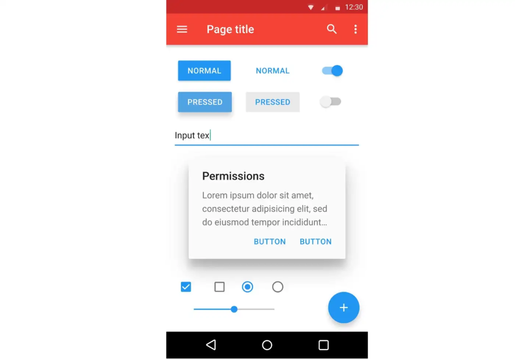

Material Design 2 (2018) 引入 Material Theming,
讓品牌能更自由地客製化形狀與顏色。
Material Design 的演進
Material Design 3 / Material You (2021~)
強調「個人化」與「無障礙」
- 引入動態色彩
- 更具彈性的跨裝置適配能力
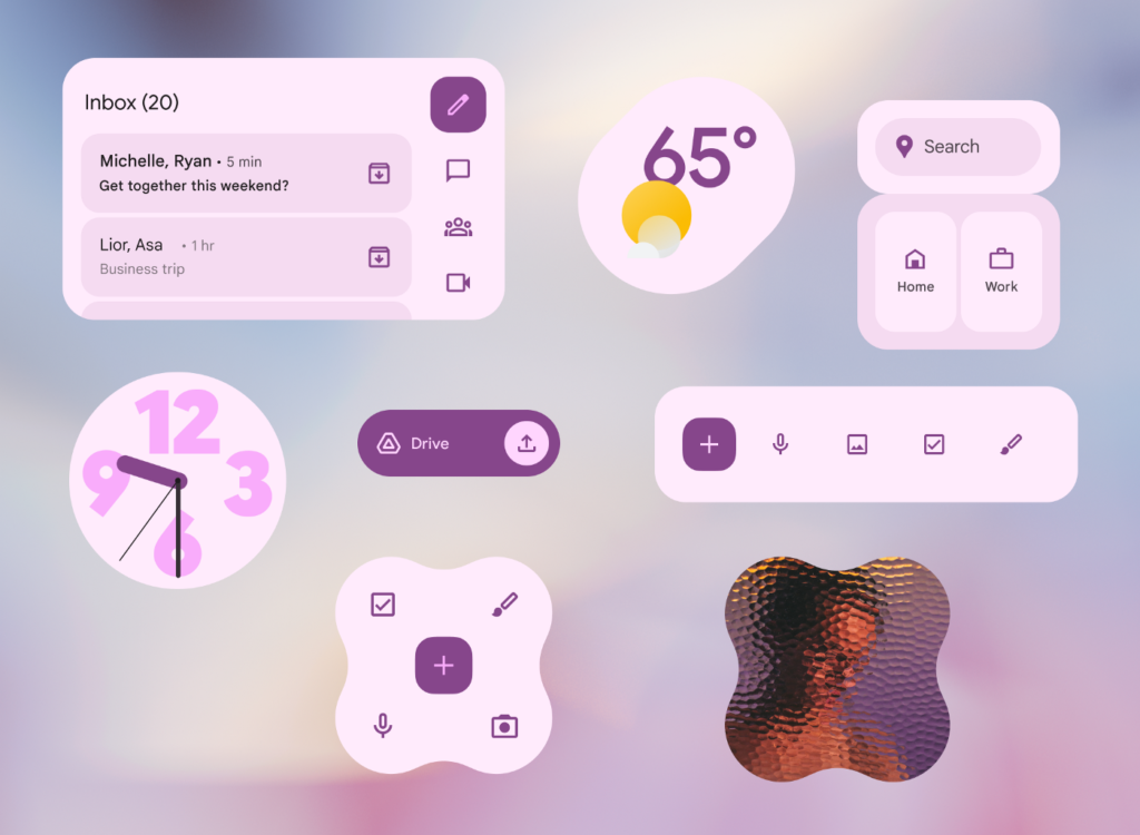
個人化: (n) Personalization [ˋpɝsnəlˌaɪz]
無障礙: (n) Accessibility [ˌæksɛsəˋbɪlətɪ]
(中間11個字母簡稱 A11y)
物理世界的隱喻
Material is the metaphor
數位世界的紙與墨
- 材質特性: 介面由類似紙張的表面構成,具有厚度與層級。
- 光影與深度: 透過陰影與光線表達元件之間的前後關係。
- 直覺操作: 使用者可以理解介面是可以被點擊、滑動或拖曳的,就像操作真實物品。
核心原則
1
隱喻: (n) Metaphor [ˋmɛtəfɚ]
借鑒平面設計的經典元素
- 排版: 清晰的層級結構,引導視覺動線。
- 網格: 提供有序的版面配置。
- 色彩與留白: 大膽的色彩運用與充足的留白,讓核心內容成為焦點。
- 沈浸感: 讓使用者一眼就能明白當前畫面的主要操作。
核心原則
2
鮮明、形象、有意義
Bold, graphic, intentional
排版學: (n.) Typography [taɪˋpɑgrəfɪ]
網格: (n.) Grids [daɪˋnæmɪk]
動畫不只是裝飾
- 引導注意力: 動畫應該引導使用者的視線到重要的變化上。
- 操作回饋: 點擊漣漪效應 (Ripple effect) 告訴使用者系統已接收到指令。
- 轉場流暢性: 狀態之間的轉換應該連續且自然,不能突兀。
核心原則
3
有意義的動畫
Motion provides meaning
◀ Ripple Effect
迎接多元裝置與個人表達
- 自適應設計: 畫面能自動適應手機、摺疊機、平板與桌面螢幕。
- 動態色彩: 根據使用者的桌布自動生成專屬的 UI 配色
- 無障礙設計: 內建符合標準的色彩對比度與觸控目標大小。
核心原則
M3 新原則
彈性與個人化
Adaptive & Personal
適應的: (adj) Adaptive [əˋdæptɪv]
動態的: (adj) Dynamic [daɪˋnæmɪk]
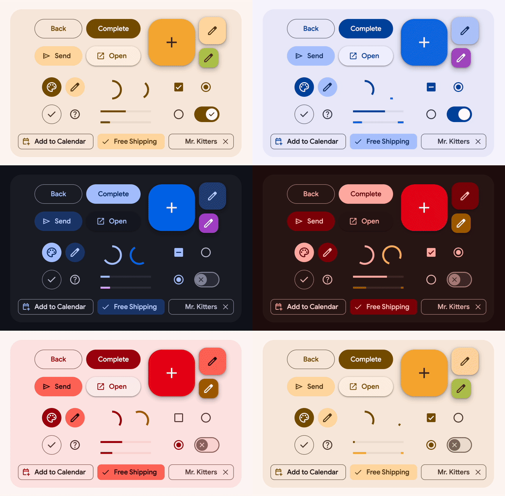
基礎元素 - 色彩系統 Color System
系統化的色彩階層
- 主要/次要/第三色彩:用於強調重點元素。
- 表面與背景色: 用於卡片、對話框與應用程式背景。
- 錯誤色: 傳達破壞性或錯誤狀態。
- On-Colors (如 On-Primary):
放在主色上的文字或圖示顏色,確保對比度與辨識度。
第三的: (adj.) Tertiary [ˋtɝʃɪ͵ɛrɪ]
基礎元素 - 排版系統
統一的字體縮放比例
- Display & Headline: 大標題,用於短暫、高衝擊力的文字。
- Title: 中等標題,用於 App Bar 或對話框。
- Label: 用於按鈕與元件內部的文字。
- Body: 長篇內文閱讀。
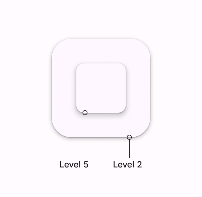
基礎元素 - 高度與層級
建立 Z 軸的空間感
- 元件在畫面中有不同的「高度」。
- M1、M2: 主要依賴陰影來區分層級。
- M3: 減少對陰影的依賴,用不同的色彩明暗度來區別高度,使介面更乾淨現代。
高度: (n) Elevation [͵ɛləˋveʃən]
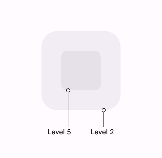
<M2
M3>
依據重要性選擇按鈕類型
- Filled Button: 搶眼的主題色,用於流程中最終且最重要的決定(如:儲存、送出)
- Tonal Button: 比 Filled 按鈕柔和,常用於「下一步」或次要但仍重要的操作
- Elevated button: 自帶陰影,用於背景圖樣太複雜、需與背景產生「視覺分離」時
- Outlined Button: 通常與實心按鈕搭配使用 (如:取消)
- Text Button: 用於卡片或對話框中的輔助操作
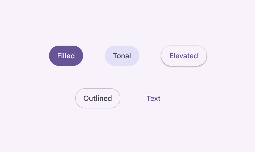
核心元件
Buttons
(色/音)調: (n) Tonal [ˈtonḷ]
升高的: (a) Elevated [ ˋɛlə͵vetɪd ]
輪廓: (a) Outlined [ˋaʊt͵laɪnd]
封裝相關資訊的容器
- 用途: 包含單一主題的內容與操作 (如:一張專輯、一則新聞)。
- 三種類型:
- Elevated : 帶有陰影,適合淺色背景。
- Filled: 不帶陰影,透過顏色區隔,現代感強。
- Outlined: 視覺干擾最少,適合需要展示大量卡片的列表。
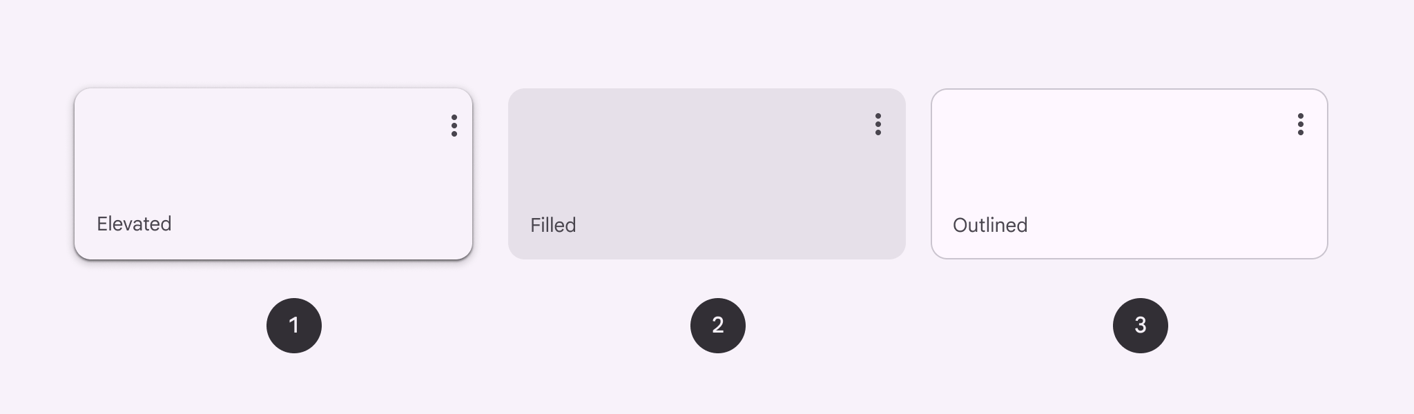
核心元件
Cards
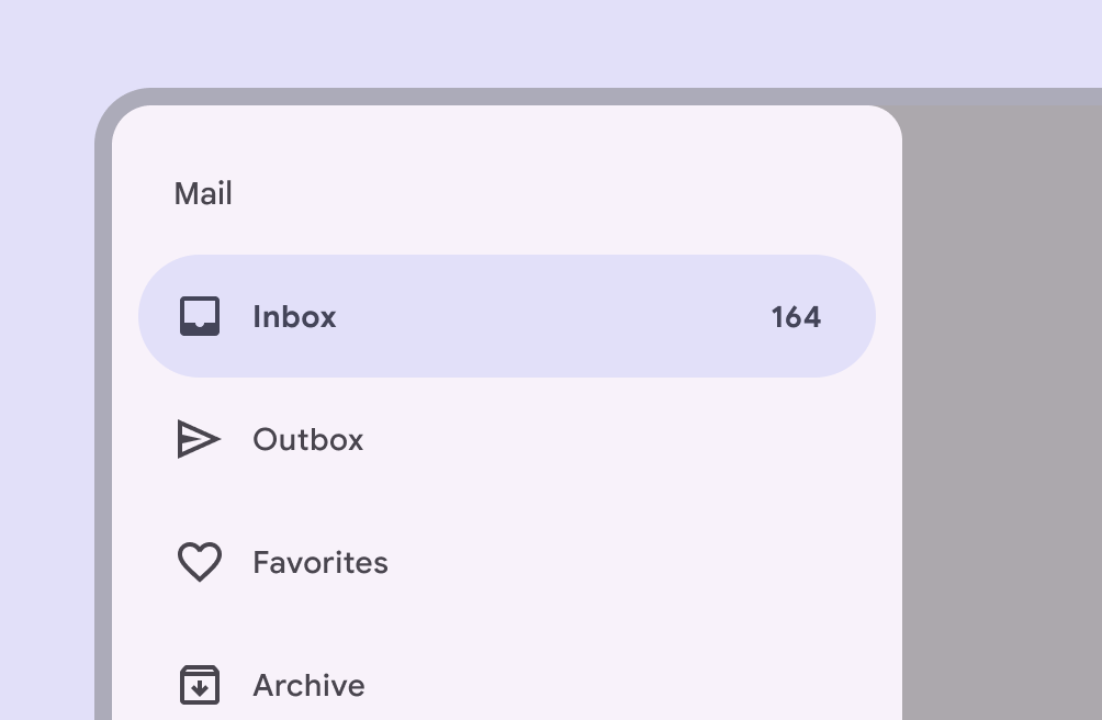
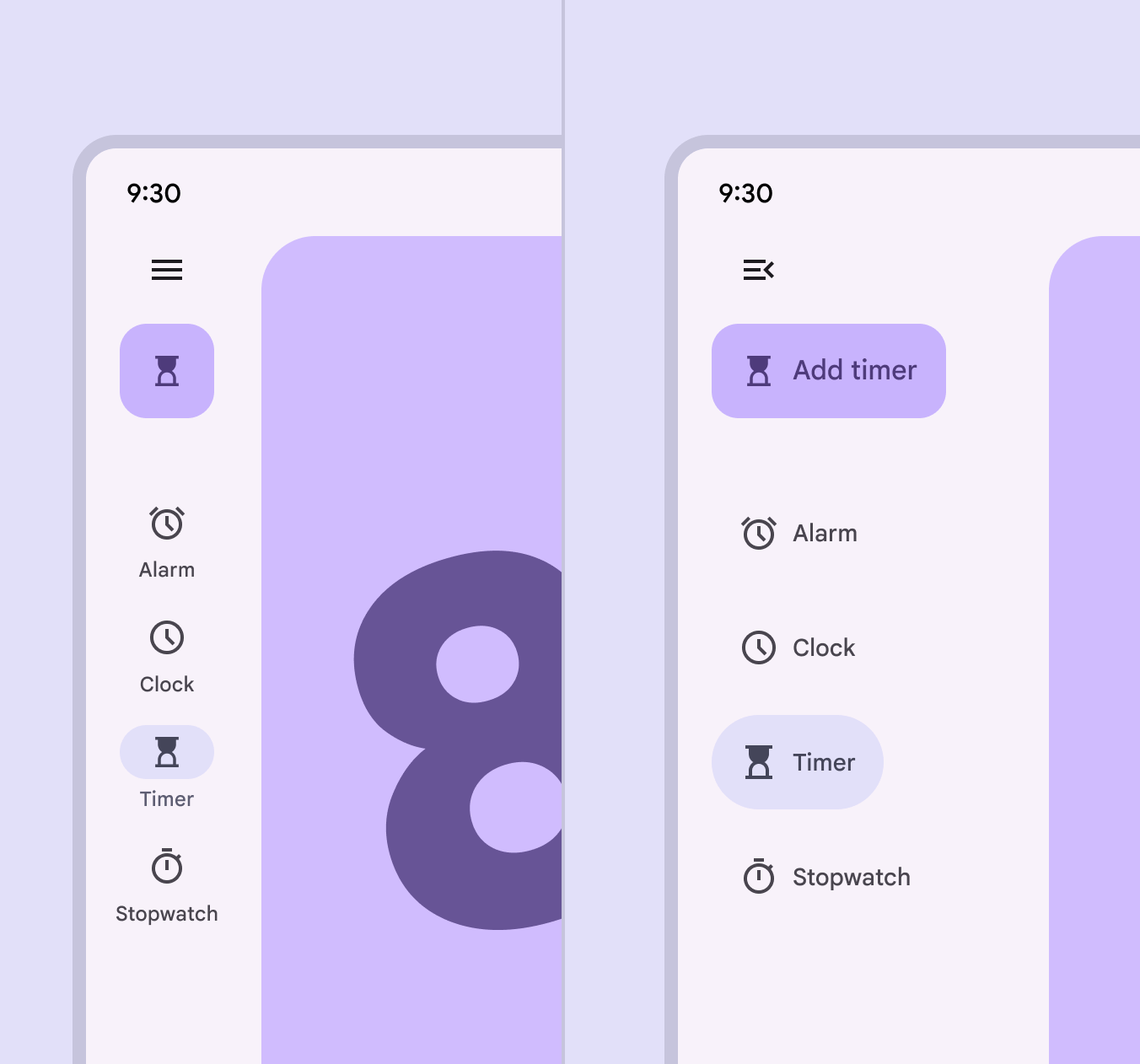
穿梭應用程式的骨幹
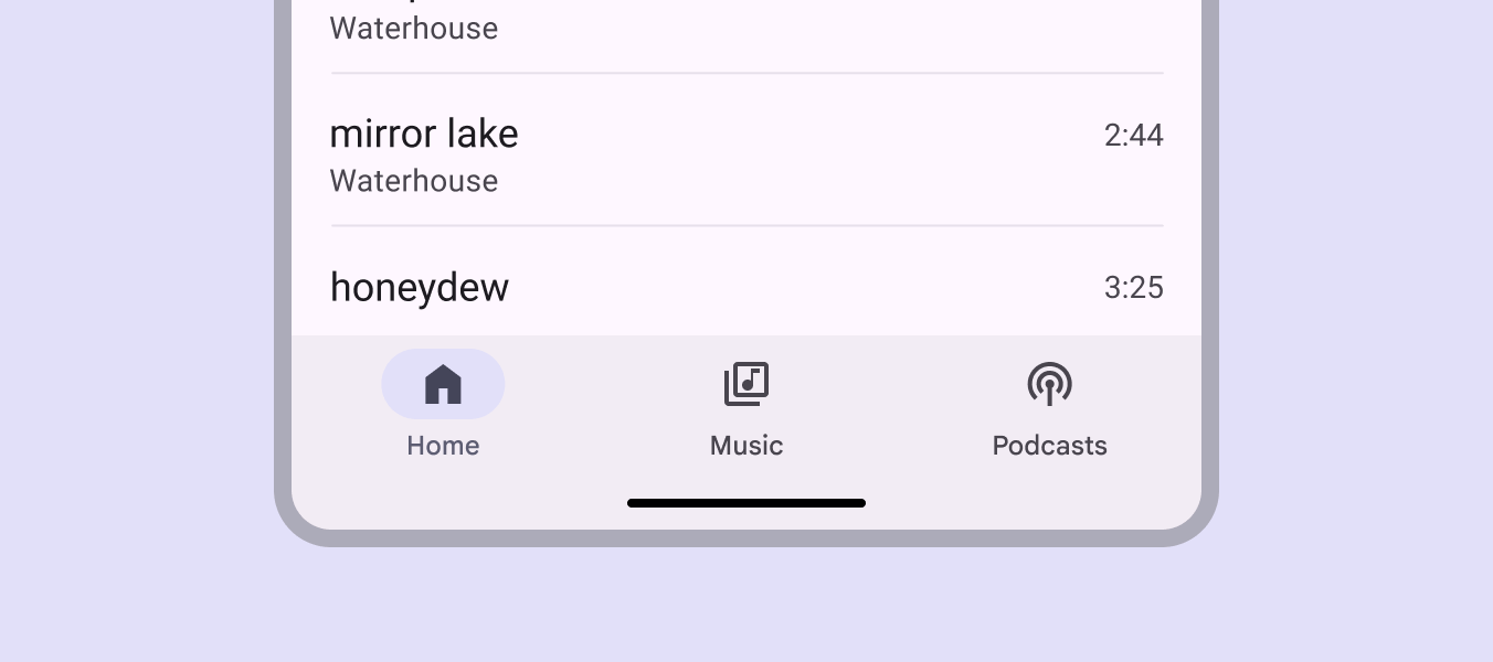
核心元件
Navigation
Navigation Bar:
適合手機端,3-5 個主要目的地的快速切換
Navigation Rail: 適合平板與桌面端,位於畫面左側
Navigation Drawer:
漢堡選單,用於隱藏超過 5 個的次要導覽項目。
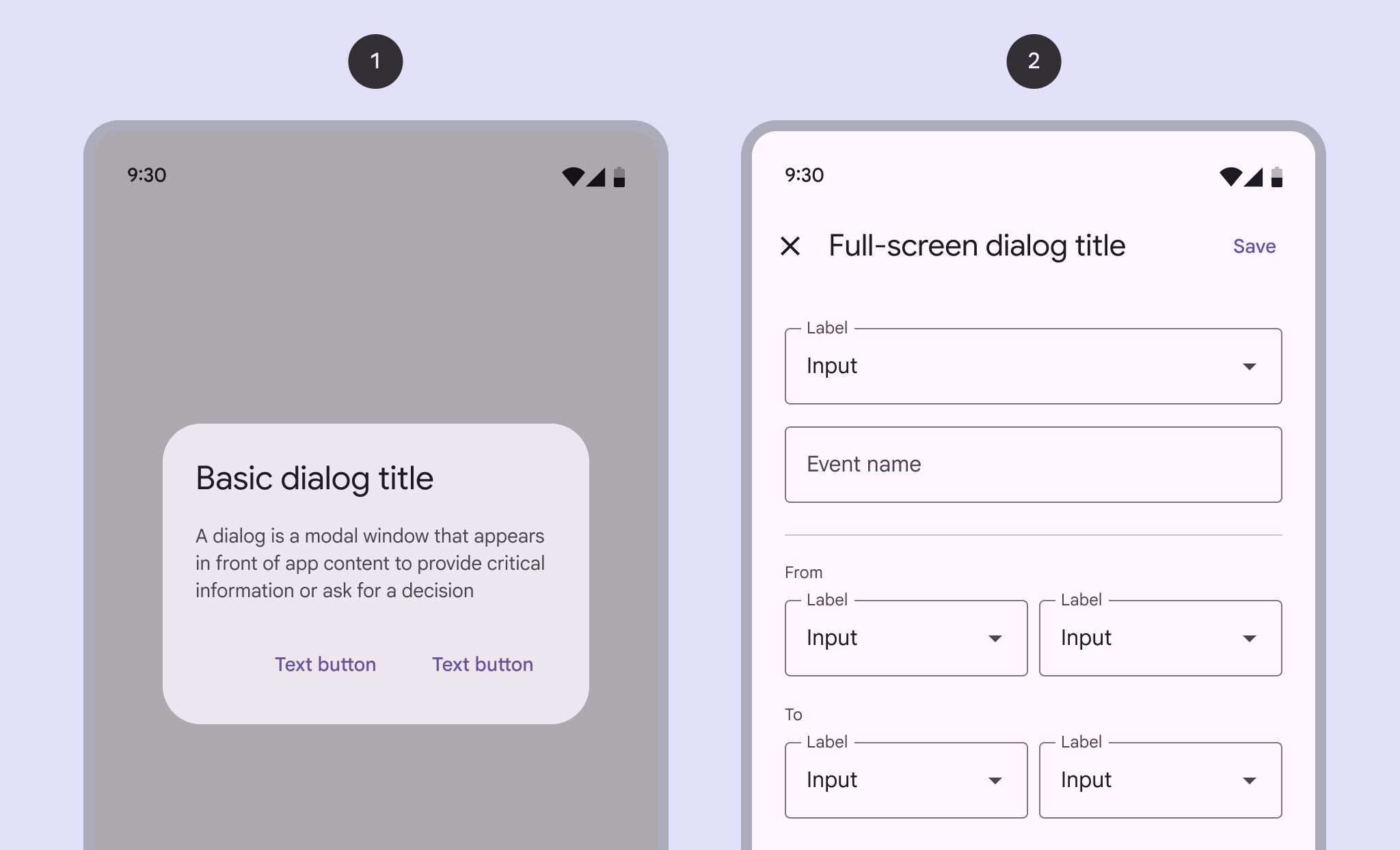
與使用者互動
核心元件
Dialog
Dialogs: 要求做出決定或確認重要訊息。
為什麼選擇 Material Design?
導入 MD 的優勢
- 節省開發時間: Google 提供了完善的開發套件 (Compose, Flutter, MDC-Web)。
- 一致的使用者體驗: 降低使用者的學習成本。
- 無障礙 (A11y) 的保證: 預設符合規範的顏色對比與觸控範圍。
- 高度可客製化: 透過 Design Tokens 輕鬆替換成企業品牌色彩。
實用資源
開始你的 Material Design 之旅
- 官方規範網站:
m3.material.io(所有的設計指南與規範都在這裡) - 設計工具: Figma 社群中的官方 Material 3 UI Kit。
- 色彩生成工具: Material Theme Builder (可一鍵生成亮暗色系的 Design Tokens)。
建立第一個 Material Design App
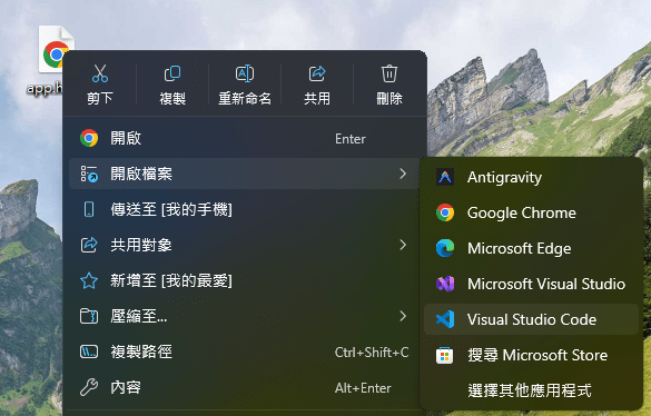
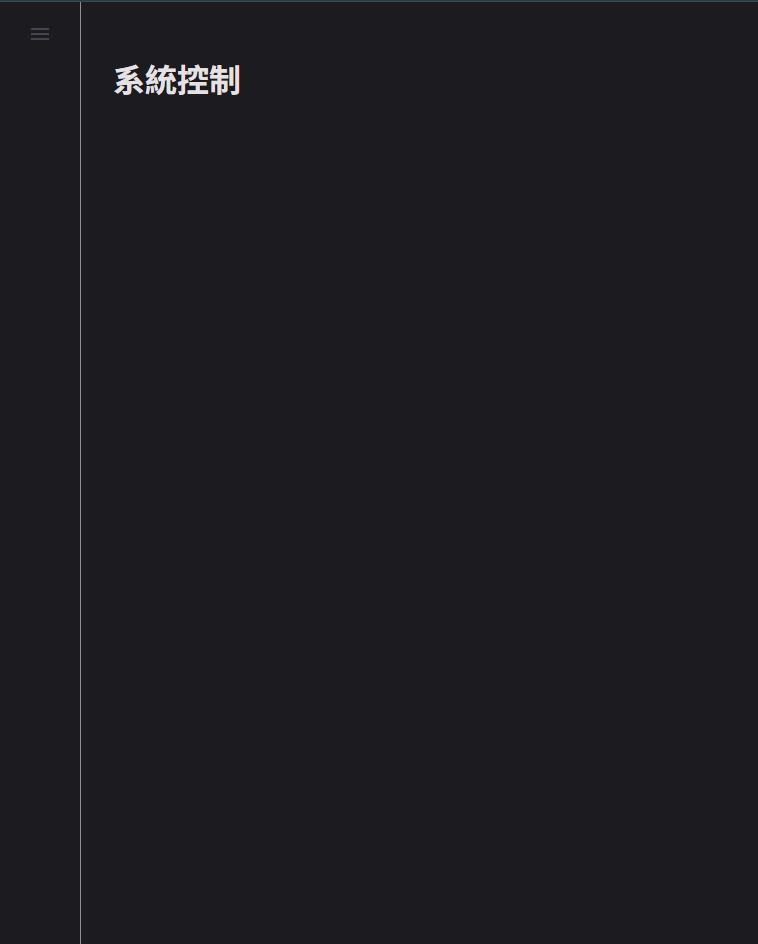
編輯程式碼:在桌面 app.html 右鍵 開啟檔案 Visual Studio Code
檢視作品:在桌面 app.html 右鍵 開啟檔案 Google Chrome / Microsoft Edge
<!DOCTYPE html>
<html lang="zh-TW">
<head>
    <meta charset="UTF-8">
    <meta name="viewport" content="width=device-width, initial-scale=1.0">
    <title>系統控制</title>

    <link href="https://fonts.googleapis.com/css2?family=Roboto:wght@400;500;700&display=swap" rel="stylesheet">
    <link href="https://fonts.googleapis.com/icon?family=Material+Symbols+Outlined" rel="stylesheet">

    <script type="importmap">
        { "imports": { "@material/web/": "https://esm.run/@material/web/" } }
    </script>
    <script type="module"> import '@material/web/all.js'; </script>

    <style>
        :root {
            /* 顏色系統 */
            --md-sys-color-primary: #D0BCFF;
            --md-sys-color-on-primary: #381E72;
            --md-sys-color-surface: #1C1B1F;
            --md-sys-color-on-surface: #E6E1E5;
            --md-sys-color-surface-container: #211F26;
            --md-sys-color-outline: #938F99;
            --md-sys-color-secondary-container: #4A4458;
            --md-sys-color-on-secondary-container: #E8DEF8;

            font-family: 'Roboto', sans-serif;
        }

        body {
            margin: 0;
            background-color: var(--md-sys-color-surface);
            color: var(--md-sys-color-on-surface);
            display: flex;
            height: 100vh;
        }

        aside {
            width: 80px;
            border-right: 1px solid var(--md-sys-color-outline);
            display: flex;
            flex-direction: column;
            align-items: center;
            padding: 12px 0;
            gap: 12px;
        }

        main {
            flex-grow: 1;
            padding: 32px;
            overflow-y: auto;
        }
    </style>
</head>

<body>

    <aside>
        <md-icon-button><span class="material-symbols-outlined">menu</span></md-icon-button>
    </aside>

    <main>
        <h1 class="md-typescale-display-medium">系統控制</h1>
    </main>

</body>
</html>
◀ 程式碼
建立第一個 Material Design App
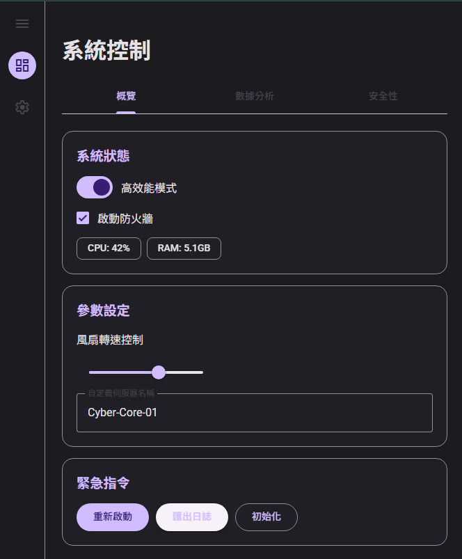
建立第一個 Material Design App
Tab
Divider
Card
Switch
Checkbox
Chip
Slider
Text Field
Button
找出組件!
到 https://material-web.dev 尋找文檔
建立第一個 Material Design App
學會查詢用法
以 Tab 為例,用法為:
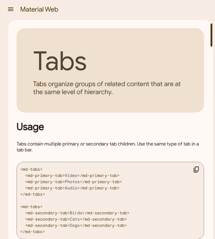
<md-tabs>
  <md-primary-tab>Video</md-primary-tab>
  <md-primary-tab>Photos</md-primary-tab>
  <md-primary-tab>Audio</md-primary-tab>
</md-tabs>

<md-tabs>
  <md-secondary-tab>Birds</md-secondary-tab>
  <md-secondary-tab>Cats</md-secondary-tab>
  <md-secondary-tab>Dogs</md-secondary-tab>
</md-tabs>
插入到你的程式碼:
<!DOCTYPE html>
<html lang="zh-TW">

<head>
    <meta charset="UTF-8">
    <meta name="viewport" content="width=device-width, initial-scale=1.0">
    <title>系統控制</title>

    <link href="https://fonts.googleapis.com/css2?family=Roboto:wght@400;500;700&display=swap" rel="stylesheet">
    <link href="https://fonts.googleapis.com/icon?family=Material+Symbols+Outlined" rel="stylesheet">

    <script type="importmap">
        { "imports": { "@material/web/": "https://esm.run/@material/web/" } }
    </script>
    <script type="module"> import '@material/web/all.js'; </script>

    <style>
        :root {
            /* 顏色系統 */
            --md-sys-color-primary: #D0BCFF;
            --md-sys-color-on-primary: #381E72;
            --md-sys-color-surface: #1C1B1F;
            --md-sys-color-on-surface: #E6E1E5;
            --md-sys-color-surface-container: #211F26;
            --md-sys-color-outline: #938F99;
            --md-sys-color-secondary-container: #4A4458;
            --md-sys-color-on-secondary-container: #E8DEF8;

            font-family: 'Roboto', sans-serif;
        }

        body {
            margin: 0;
            background-color: var(--md-sys-color-surface);
            color: var(--md-sys-color-on-surface);
            display: flex;
            height: 100vh;
        }

        aside {
            width: 80px;
            border-right: 1px solid var(--md-sys-color-outline);
            display: flex;
            flex-direction: column;
            align-items: center;
            padding: 12px 0;
            gap: 12px;
        }

        main {
            flex-grow: 1;
            padding: 32px;
            overflow-y: auto;
        }
    </style>
</head>

<body>

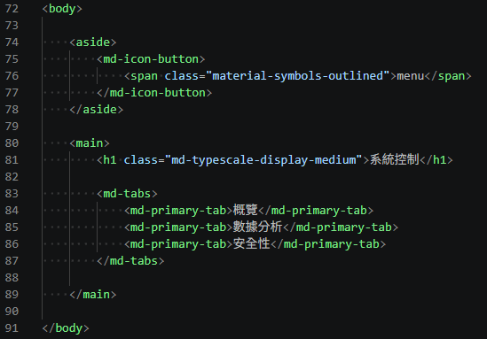
    <aside>
        <md-icon-button>
            <span class="material-symbols-outlined">menu</span>
        </md-icon-button>
    </aside>

    <main>
        <h1 class="md-typescale-display-medium">系統控制</h1>

        <md-tabs>
            <md-primary-tab>概覽</md-primary-tab>
            <md-primary-tab>數據分析</md-primary-tab>
            <md-primary-tab>安全性</md-primary-tab>
        </md-tabs>
    </main>

</body>

</html>
◀ 跳過關卡複製區
建立第一個 Material Design App
找不到的元件1
藏在 GitHub 的 Divider:
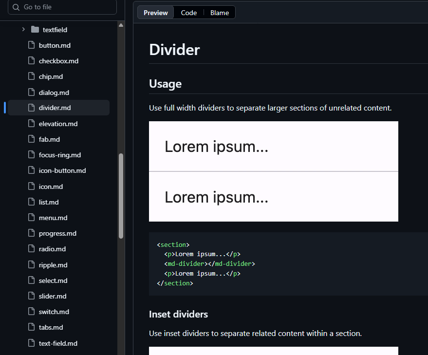
<md-divider></md-divider>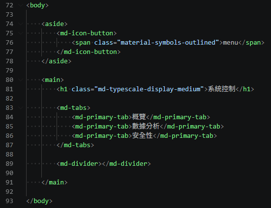
建立第一個 Material Design App
找不到的元件2
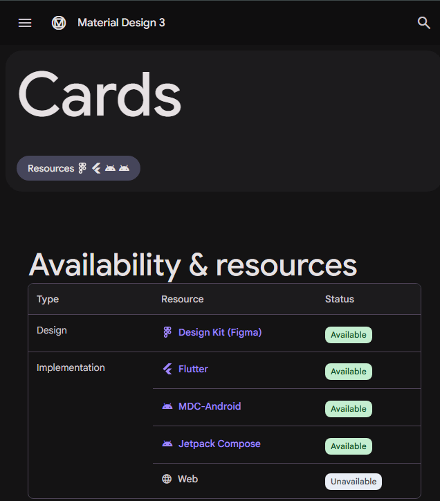
不支援 Web 的元件 Cards:
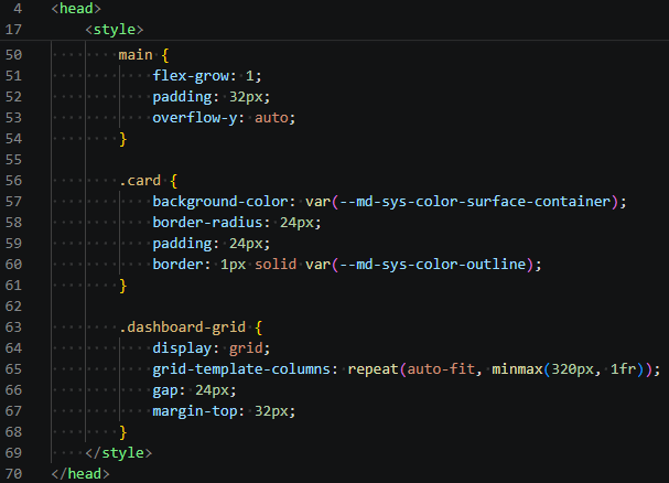
.card {
    background-color: var(--md-sys-color-surface-container);
    border-radius: 24px;
    padding: 24px;
    border: 1px solid var(--md-sys-color-outline);
}

.dashboard-grid {
    display: grid;
    grid-template-columns: repeat(auto-fit, minmax(320px, 1fr));
    gap: 24px;
    margin-top: 32px;
}
手搓樣式:
◀ 卡片
◀ 網格
建立第一個 Material Design App
找不到的元件2
插入卡片:
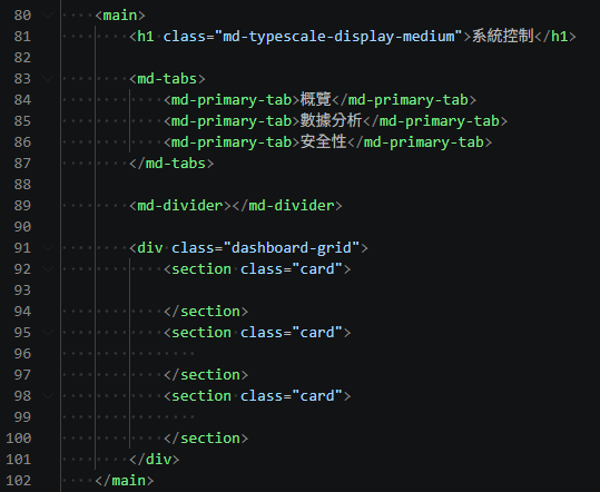
<!DOCTYPE html>
<html lang="zh-TW">

<head>
    <meta charset="UTF-8">
    <meta name="viewport" content="width=device-width, initial-scale=1.0">
    <title>系統控制</title>

    <link href="https://fonts.googleapis.com/css2?family=Roboto:wght@400;500;700&display=swap" rel="stylesheet">
    <link href="https://fonts.googleapis.com/icon?family=Material+Symbols+Outlined" rel="stylesheet">

    <script type="importmap">
        { "imports": { "@material/web/": "https://esm.run/@material/web/" } }
    </script>
    <script type="module"> import '@material/web/all.js'; </script>

    <style>
        :root {
            /* 顏色系統 */
            --md-sys-color-primary: #D0BCFF;
            --md-sys-color-on-primary: #381E72;
            --md-sys-color-surface: #1C1B1F;
            --md-sys-color-on-surface: #E6E1E5;
            --md-sys-color-surface-container: #211F26;
            --md-sys-color-outline: #938F99;
            --md-sys-color-secondary-container: #4A4458;
            --md-sys-color-on-secondary-container: #E8DEF8;

            font-family: 'Roboto', sans-serif;
        }

        body {
            margin: 0;
            background-color: var(--md-sys-color-surface);
            color: var(--md-sys-color-on-surface);
            display: flex;
            height: 100vh;
        }

        aside {
            width: 80px;
            border-right: 1px solid var(--md-sys-color-outline);
            display: flex;
            flex-direction: column;
            align-items: center;
            padding: 12px 0;
            gap: 12px;
        }

        main {
            flex-grow: 1;
            padding: 32px;
            overflow-y: auto;
        }

        .card {
            background-color: var(--md-sys-color-surface-container);
            border-radius: 24px;
            padding: 24px;
            border: 1px solid var(--md-sys-color-outline);
        }

        .dashboard-grid {
            display: grid;
            grid-template-columns: repeat(auto-fit, minmax(320px, 1fr));
            gap: 24px;
            margin-top: 32px;
        }
    </style>
</head>

<body>

    <aside>
        <md-icon-button>
            <span class="material-symbols-outlined">menu</span>
        </md-icon-button>
    </aside>

    <main>
        <h1 class="md-typescale-display-medium">系統控制</h1>

        <md-tabs>
            <md-primary-tab>概覽</md-primary-tab>
            <md-primary-tab>數據分析</md-primary-tab>
            <md-primary-tab>安全性</md-primary-tab>
        </md-tabs>

        <md-divider></md-divider>

        <div class="dashboard-grid">
            <section class="card">

            </section>
            <section class="card">

            </section>
            <section class="card">

            </section>
        </div>
    </main>

</body>

</html>
◀ 跳過關卡複製區
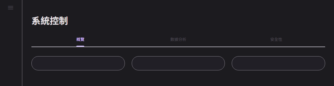
▲ 在寬螢幕能平分空間
建立第一個 Material Design App
在同一行顯示:
.row { display: flex; align-items: center; gap: 16px; margin-bottom: 20px; }h2 { margin: 0 0 20px 0; font-size: 1.4rem; color: var(--md-sys-color-primary); }使用方式:
<div class="row">

<div>
h2 使用主要顏色:
<span class="md-typescale-body-large">高效能模式</span>自己動手做
元件說明文字: